
On this opportunity we are going to discuss perhaps the most famous and most used of the 7 basic quality tools: The Pareto diagram.
Created by Vilfredo Pareto and also known as ABC distribution, Pareto chart or 80-20 curve, this tool allows us to separate the most relevant problems from those that are not important, through the application of the 80-20 principle or Pareto principle, which at a general level goes like this:
20% of the causes generate 80% of the consequences.
The Pareto principle is used in many fields: from economics to sociology, including self-improvement, for example. Today we are going to look at the Pareto chart applied to process analysis and improvement.
This is today’s topic for business management.
Pareto Principle
The Pareto principle or rule tells us that for various cases, 80% of the consequences come from 20% of the causes. These are not exact figures, since it is considered an empirical base observed by Vildredo Pareto and subsequently confirmed by other experts in various areas of knowledge.
Some classic statements of the law:
- 80% of your success comes from 20% of your effort.
- 80% of your income comes from 20% of your effort.
- 80% of your income is generated by 20% of your customers.
- 80% of sales are generated by 20% of the products.
In a problem situation:
80% of “problem” is generated from 20% of “causes”.
What is the Pareto Chart
Now we are getting down to business. The Pareto chart consists of a bar chart that classifies from left to right in descending order the causes or factors detected around a phenomenon. From now on we will speak of problems as causes and phenomena as problematic situations.
This allows us to concentrate our efforts on those problems that represent that 80%.
In this sense, we use the Pareto Chart for:
- Continuous improvement.
- The study of recent implementations or changes (how it was before – how it is after).
- Analysis and prioritization of problems.
How to make the Pareto diagram
There are several instructions on how to make a Pareto analysis in books and on the web, although they all lead to the same thing. That’s why I believe that the best way to learn is always with an example. However, let’s see how to make a Pareto diagram step by step and then, make an example.
An important clarification is that there are no specific steps depending on the situation that is analyzed with the diagram, that is, the methodology will always be the same, although the language in which it is explained is different.
- Determine the problem situation: Is there a problem? What is it?
- Determines the problems (causes or categories) around the problem situation, including the time period.
- Collect data: There is a problem situation arising and you have the possible causes that generate it, so start collecting data. This will depend on the nature of the problem. For example number of defects if we are analyzing breakdowns in a product, cost of waste according to the type of waste, kilograms of load by type of product. Remember that the units must be the same, do not mix apples and pears. Remember also that the time period is the same for all, if you are going to collect data pertaining to a quarter, it must be the same for all causes.
- Order from highest to lowest: We order from highest to lowest the causes based on the data we collect and their measure. If it is the number of times an event occurs, it will be by quantity; if it is by cost of waste according to the type of product, it will be in monetary units, for example.
- Make the calculations: From the ordered data, we calculate the accumulated, the percentage and the accumulated percentage. In the example I show you in detail how to do it.
- We plot the causes: We use the X-axis to place the causes. We are going to use the left Y axis and the right Y axis. The left one is for the frequency of each cause, we use it to draw them with vertical bars.
- We plot the cumulative curve: The right Y-axis is for the cumulative percentage, so it goes from 0 to 100%. We use it to plot the cumulative curve.
- We analyze the diagram.
Example of a Pareto diagram
Let’s work on the same solved exercise of the problem tree: Increase of complaints and claims made by customers.
Digital GrownUP is a software design and network installation company. Their mission is to install private networks for organizations, provide system maintenance, and provide monitoring software for the organization that hires them.
In the last quarter, the company has recorded an increase in customer complaints regarding both the installation and maintenance of the networks, as well as the performance of the software.
Step 1: Increase in complaints.
In step 2 we will identify the causes or categories that generate the increase in complaints. For this, we make a review of the complaints and we obtain:
- The after-sales staff does not know how to install the product (the network).
- The after-sales service does not show up on time.
- The product does not have spare parts.
- The operation of the product (the software) is confusing
- After-sales staff is rude or has no service attitude
- The price of the product has increased a lot
- The product takes a long time to turn on
- Product (network installation) is damaged very fast
- Product parts do not arrive complete
- Contact center staff is rude or has no service attitude
In step 3 we collect the data (frequency) of the complaints and in step 4 we order them from highest to lowest in a table. The data provided by the quality control department to Digital GrownUp is as follows:
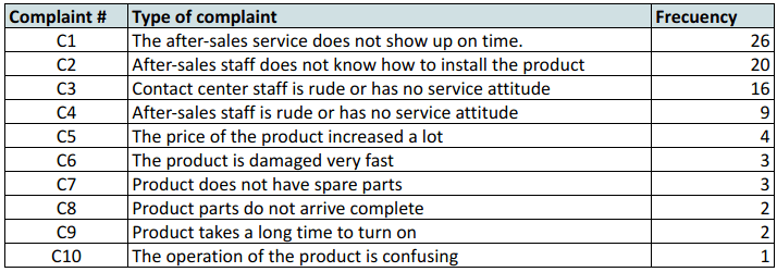
In step 5 we calculate the cumulative frequency, the percentage and the cumulative percentage.
Recall the statistics class:
- Frequency is the number of times a cause (in this case a type of complaint) is repeated.
- By cumulative frequency we mean the sum of the above frequencies including the frequency of the cause being analyzed. For example, looking at Q2, we see that its frequency is 20, to this number we must add all the previous frequencies, which in this case is only the frequency of Q1, 26. The result is 46, which is the cumulative frequency of Q2.
- By percentage we mean the share of the number of times a complaint is repeated in the total number of complaints. For example: The product is damaged very quickly, is a type of complaint that occurred 3 times out of a total of 86. By rule of three, if 86 is 100%, 3 becomes: (3*100%)/86. Or simply divide 3 by 86 🙂 This same is done with all the others.
- The cumulative percentage is exactly the same as the cumulative frequency, only this time we do the cumulative sum of percentage.
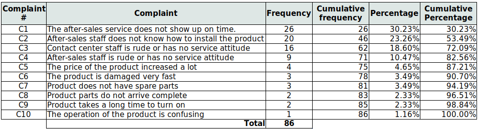
So far, we have the following table:
In step 6 we place each of the problems on a bar chart. As mentioned earlier in the step-by-step, there is a left Y-axis and a right Y-axis. On the left Y-axis we place each of the causes based on their relative frequency. Each cause will be placed along the X-axis.
In step 7 we draw the cumulative curve according to the cumulative percentage of each cause, based on the right Y-axis.
This is the Pareto diagram:
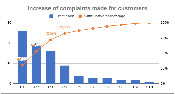
In step 8 we analyze.
72% is concentrated in the first 3 causes. This distribution is sufficient to direct our efforts to solve these problems. Subsequently and if desired, we can make a new Pareto analysis with the remaining causes, where 80% will be represented in other causes. In this way, we will be finishing with the problematic situation.
I need Pareto Chart for Municipalities energy managment